Packaging & art direction
La Fella
Overview
Real bite deserves real packaging.
Packaging and art direction for La Fella’s biscuit range — the Larino wholegrain line and the Čajni and Čoko tea biscuits. Concept, layout, colour, and the art direction of the product photography. The Larino biscuit earned a Grand Gold Medal for Quality at the Novi Sad Fair — recognition for its recipe and taste.
The Design
The wordmark leads — assertive, warm, unmistakably its own. A colour-coded system lets each product claim its identity while the family stays instantly legible. Nothing sits on the pack that doesn’t need to be. It reads in a fraction of a second from across the aisle, and rewards a closer look.
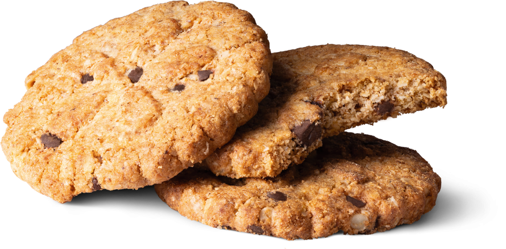
The Photography
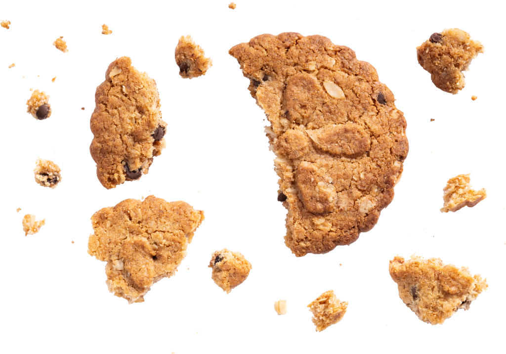
The biscuits deserved better than stock photos. I brought in a photographer and art-directed the shoot — every crumb, every bite mark, every stack staged for the pack. What you see on the shelf is the real biscuit, shot to look exactly as good as it tastes.
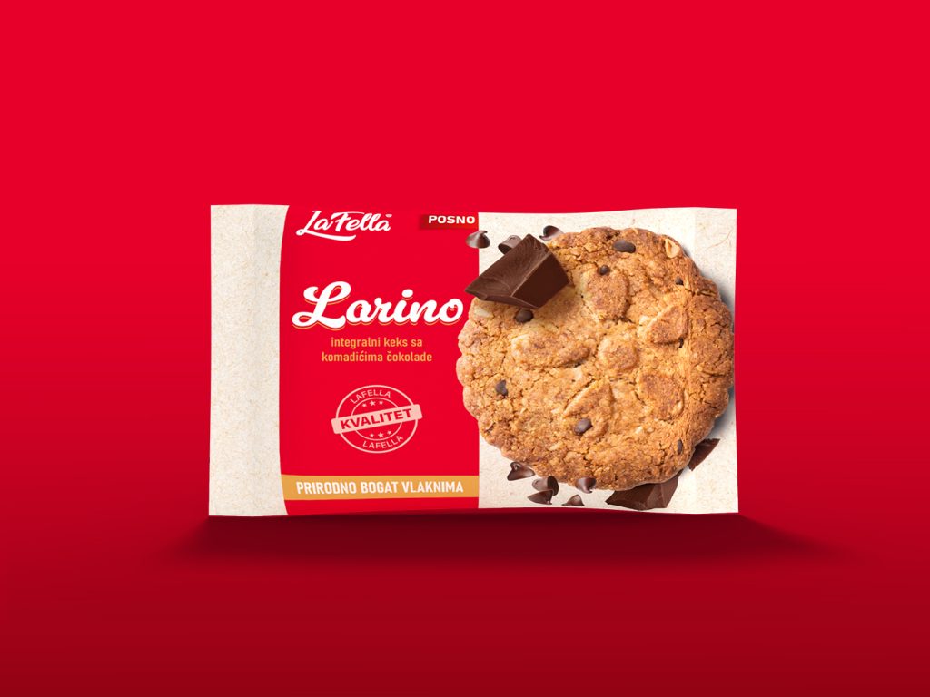
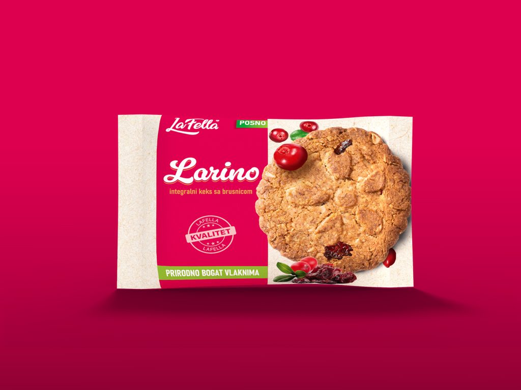
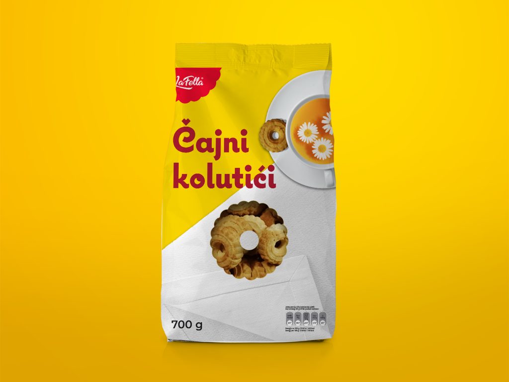
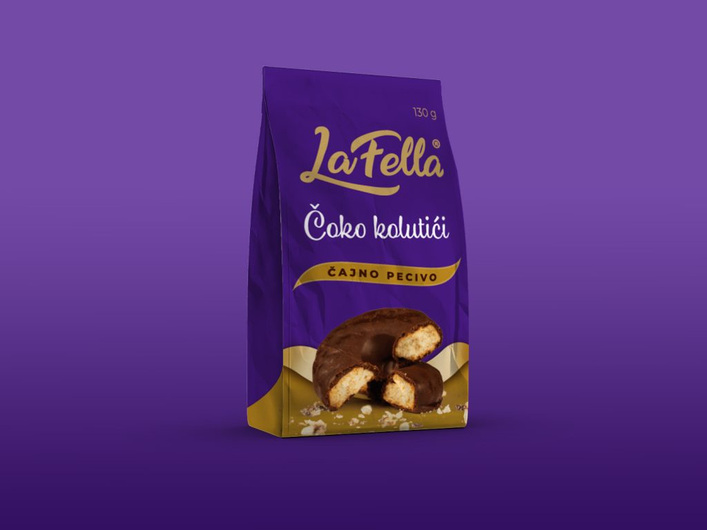
One system, many appetites. From the Čajni and Čoko tea biscuits to the Larino wholegrain range — cranberry and chocolate — colour separates the variants while structure holds them together. Side by side on shelf, the line looks like exactly what it is: one brand speaking in several flavours, never losing its voice.
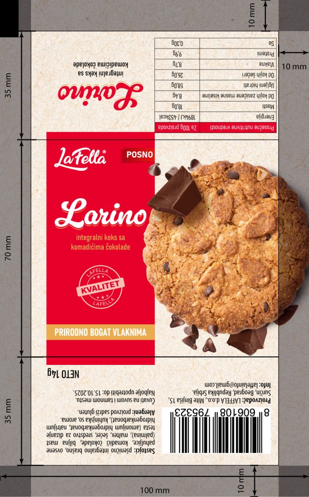
Good design has to survive the print run. The dieline behind the finished pack is where the craft lives — every fold, bleed and registration mark resolved before a single unit went to production. What looks effortless on shelf is engineered to the millimetre.

Art direction: Dušan Turajlić · Photography: Vladimir Pavlović