Brand identity · Print
DB Real Estate
Overview
The whole agency is one woman. So is the mark.
Complete identity for DB Real Estate — Danka Blagojević’s one-woman agency selling seaside properties in northern Greece to Serbian and Macedonian buyers. Logo, brand book, stationery, bilingual print, social presence — and a property website to carry it.
The Client
Danka runs everything herself, from Katerini: houses, apartments and plots along the Aegean coast, sold almost entirely to buyers from Serbia and North Macedonia. When the whole company is one person, the identity carries one person’s word — it had to feel personal and look established at the same time.
The Mark
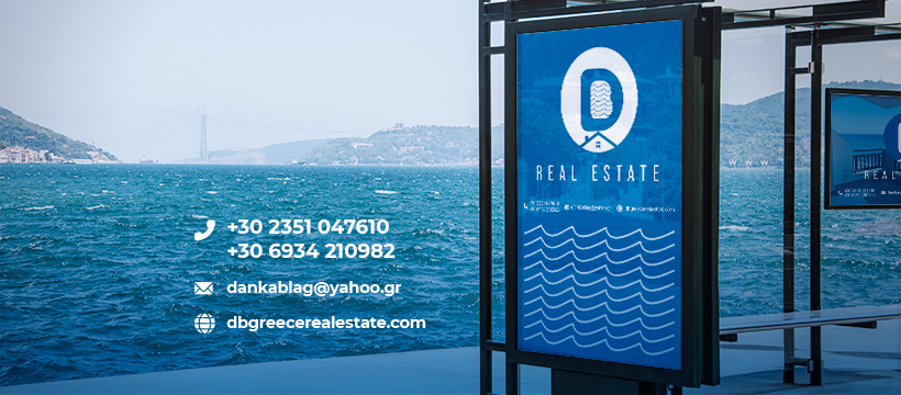
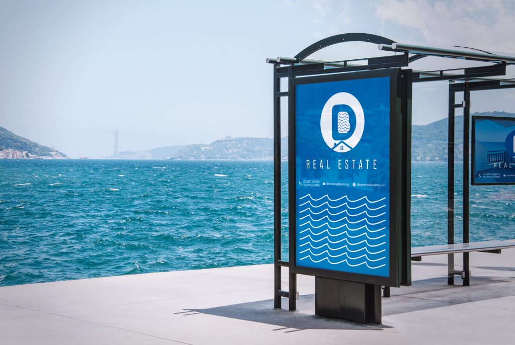
Six directions were proposed. The one that won puts her initials to work: D and B merged into a single monogram — the B drawn as waves of the Aegean, a house roof cut into the negative space below. Owner, sea, real estate. One mark, three stories.
The System
From the mark outward: Pantone 300 blue, a locked type system, memorandum and envelope carrying the Greek legal details, business cards set in Serbian and Greek, door hangers for the properties themselves — and a WordPress property-listing site written in Serbian, aimed squarely at the buyers, not the neighbours.

Initials
D and B. Danka Blagojević — the agency is her name, so the mark is too.
The Aegean
The counter of the B is drawn as waves. Every property she sells is by this sea.
The House
A roof, cut into the negative space. You see the D first — the house finds you a moment later.
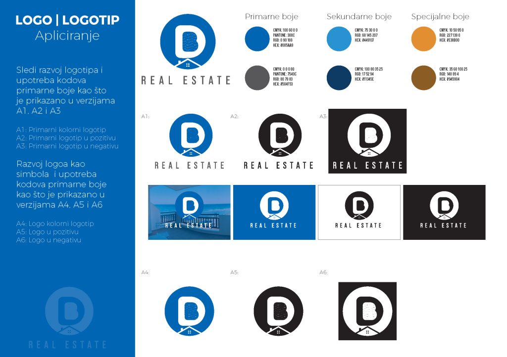
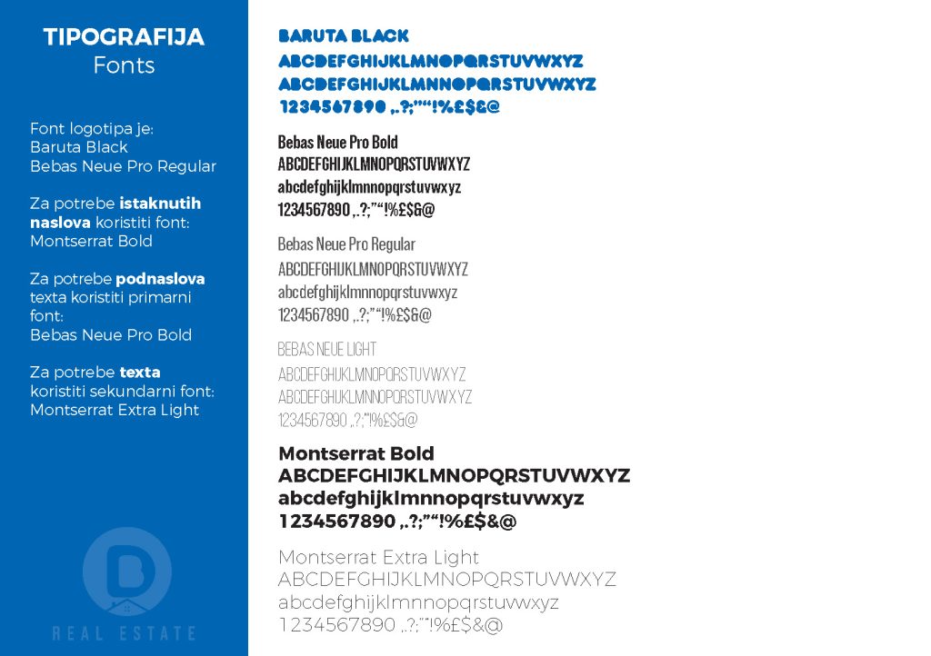
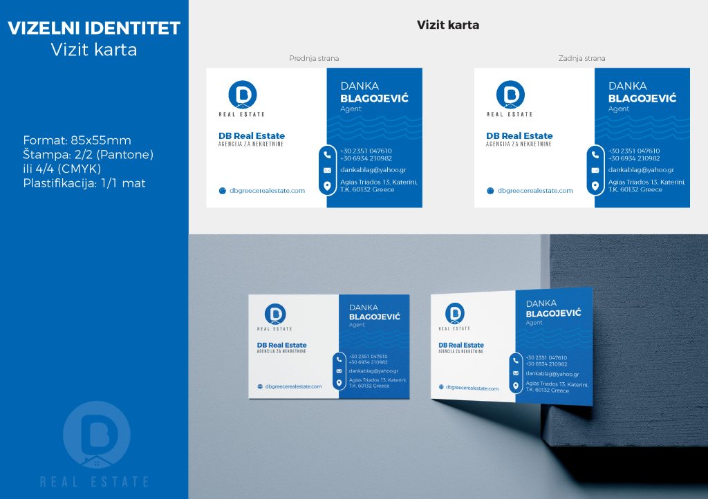
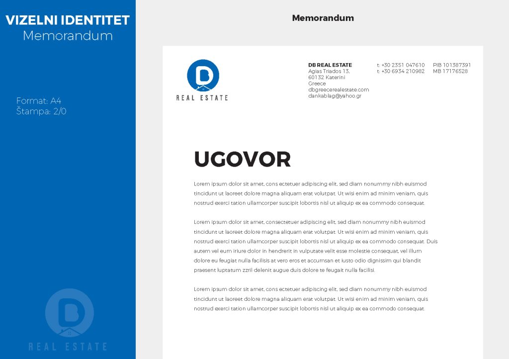
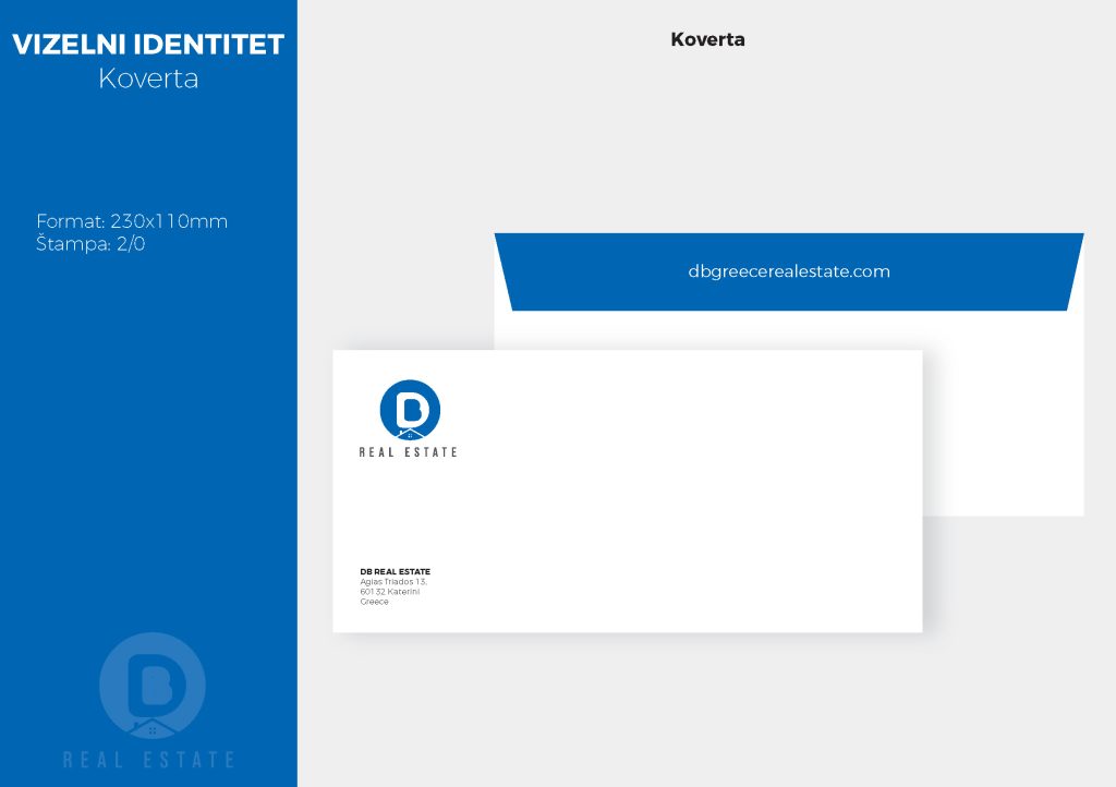
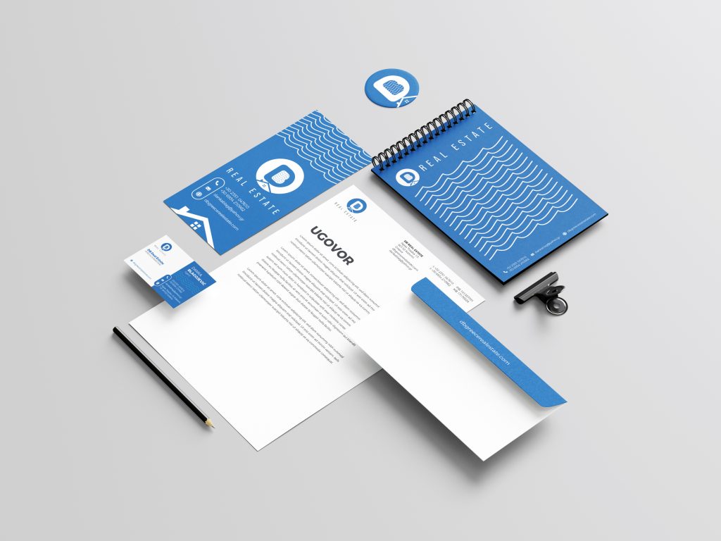
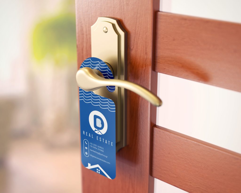
Four years on, the identity is still doing its job — unchanged — in front of sixteen thousand followers. No refresh, no drift. A mark built once, built to last.